Skip to content

Instantly share code, notes, and snippets.

@JoeyBurzynski
Last active November 17, 2024 14:13
Show Gist options
  • Save JoeyBurzynski/617fb6201335779f8424ad9528b72c41 to your computer and use it in GitHub Desktop.
Save JoeyBurzynski/617fb6201335779f8424ad9528b72c41 to your computer and use it in GitHub Desktop.
58 bytes of css to look great nearly everywhere

58 bytes of CSS to look great nearly everywhere

When making this website, i wanted a simple, reasonable way to make it look good on most displays. Not counting any minimization techniques, the following 58 bytes worked well for me:

main {
  max-width: 38rem;
  padding: 2rem;
  margin: auto;
}

let's break this down:

max-width: 38rem

it appears that the default font size for most browsers is 16px, so 38rem is 608px. supporting 600px displays at a minimum seems reasonable.

padding: 2rem

if the display's width goes under 38rem, then this padding keeps things looking pretty good until around 256px. while this may seem optional, it actually hits two birds with one stone - the padding also provides sorely-needed top and bottom whitespace.

margin: auto

this is really all that is needed to center the page, because main is a block element under semantic html5.

a key insight: it took me a surprising number of iterations to arrive at this point. perhaps that speaks to the fact that i know nothing about "modern" web development, or, as i'm more inclined to believe, just how hard it is to keep it simple in a world of complication.

update 1: following some discussion, I've since changed the padding to 1.5rem for a happier compromise between mobile and desktop displays.

update 2: the ch unit was brought to my attention, and I quite like it! I've since changed to 70ch/2ch, which looks nearly the same with 2 less bytes, except that the padding is a little bit smaller (a good thing for mobile).

100 Bytes of CSS to look great everywhere (enhanced version)

This should be simple drop-in css to look good on most displays:

html {
  max-width: 70ch;
  padding: 3em 1em;
  margin: auto;
  line-height: 1.75;
  font-size: 1.25em;
}

Let's break this down. I've adapted the original text with my own commentary.

max-width: 70ch

the "readable range" is usually 60-80 character widths, and CSS lets you express that directly with the ch unit.

padding: 3em 1em

If the display's width goes under the max-width set above, then this padding prevents edge-to-edge text on mobile. We use 3em to provide top/bottom whitespace.

margin: auto

This is really all that is needed to center the page - applied on html, because Dan's site doesnt have a semantic

tag and is more likely to exist in most sites. That the top tag centers itself relative to nothing is unintuitive, but thats how browsers do.

line-height: 1.75

Spacing between the lines to help increase visual clarity. Always leave line height unitless because reasons.

font-size: 1.5em

I've noticed that recent design trends and screen sizes have tended toward bigger font sizes. Or maybe I'm getting old. Prefer em or rem over px if you want to let users scale it.

You can use :root instead of <html> to guarantee that there is some selector present, but its a touch too fancy for me and uses an extra character :)

Optional 100 more bytes

h1,h2,h3,h4,h5,h6 {
  margin: 3em 0 1em;
}

p,ul,ol {
  margin-bottom: 2em;
  color: #1d1d1d;
  font-family: sans-serif;
}
References

@antics
Copy link

antics commented Sep 25, 2022

html{margin:0 auto;max-width:80ch;padding:0.6em;font-family:serif;line-height:1.6;background:#FFF;color:#222}h1,h2,h3{color:#444}img{width:100%}@media print{color:unset}

That's 173 bytes with @rany2 print support.

You can remove font-family, background and color styling:

html{margin:0 auto;max-width:80ch;padding:0.6em;line-height:1.6}img{width:100%}

for a total of 80 bytes.

@williamyeny
Copy link

williamyeny commented Sep 25, 2022

FYI, the original 58 bytes was created by @joshuarli

@swyxio
Copy link

swyxio commented Sep 25, 2022

If you dont mind going to 200 bytes, offering my version for others to consider https://www.swyx.io/css-100-bytes

html {
  max-width: 70ch;
  padding: 3em 1em;
  margin: auto;
  line-height: 1.75;
  font-size: 1.25em;
}

h1,h2,h3,h4,h5,h6 {
  margin: 3em 0 1em;
}

p,ul,ol {
  margin-bottom: 2em;
  color: #1d1d1d;
  font-family: sans-serif;
}

i really like having heading and list/para space and also softening the text colors. basic advice given in https://jgthms.com/web-design-in-4-minutes/

@spion
Copy link

spion commented Sep 25, 2022

This is a plea, not a demand: please stop softening colors. It only looks decent on Mac displays - the rest of us on systems with different, thinner default font rendering and different color rendering profile suffer greatly from illegible text all around the web.

@Afif13
Copy link

Afif13 commented Sep 26, 2022

You can optimize the 58 bytes to one instruction like below

main {
  margin: 2rem max(2rem,50% - 19rem);
}

@juanfrank77
Copy link

You can optimize the 58 bytes to one instruction like below

main {
  margin: 2rem max(2rem,50% - 19rem);
}

Wouldn't the max calculation add extra complexity to the stylesheet? I think his enhanced version works just fine.

@swyxio
Copy link

swyxio commented Sep 26, 2022

fwiw github's text color is #24292f, not #000. designers smarter than us have put thought into why softening colors, now we are just debating degree of softening.

@PixyMisa
Copy link

Dark grey text on a light grey background looks cool, legibility be damned.

@michaelaye
Copy link

could someone tells us non-web-devs how to apply these hacks? Or point to an article?

@timbornholdt
Copy link

timbornholdt commented Sep 26, 2022

could someone tells us non-web-devs how to apply these hacks? Or point to an article?

It's actually pretty straight forward: drop that CSS in a <style type="text/css"> tag inside the <head> of your HTML file, then in the <body> tag, create a <main> section and include your content there.

As an example:

<html>
  <head>
    <style type="text/css">
      // [...] here's where you'd put whatever CSS you want to use
    </style>
  </head>
  <body>
    <main>
      <p>Hello, world!</p>
    </main>
  </body>
</html>

@vanderpool23
Copy link

Thank you for this!

80ch is what works best for accessibility. Not that 70 is wrong, just adding to the conversation.

@vanderpool23
Copy link

could someone tells us non-web-devs how to apply these hacks? Or point to an article?

I put it together in a codepen here: https://codepen.io/mvanderpool/pen/QWrOomj

@genewitch
Copy link

This is a plea, not a demand: please stop softening colors. It only looks decent on Mac displays - the rest of us on systems with different, thinner default font rendering and different color rendering profile suffer greatly from illegible text all around the web.

omg, is that why? I thought my vision was getting worse at a much faster rate than it ought.

@tomyo
Copy link

tomyo commented Sep 26, 2022

I'm surprised to find out that a background on the body or html element covers everything, regardless of margin/padding. Cool.

@spion
Copy link

spion commented Sep 26, 2022

fwiw github's text color is #24292f, not #000. designers smarter than us have put thought into why softening colors, now we are just debating degree of softening.

I'm voicing my opinion not as a designer, but as a user who nowadays struggles reading text due to the trend of increased color softening.

This may be hubris on my part, but it doesn't seem like many designers realize the variety of monitors and text rendering systems out there.

The text on this website https://jgthms.com/web-design-in-4-minutes/ causes serious strain to my eyes on a reasonably decent 4K IPS monitor. This is the case with an increasing amount of websites, to the point where I'm debating developing an extension that undoes this modification.

Please, be careful with the softening. It may cause more harm than good for some people.

@atikahjapry
Copy link

very intuitive and good explanation.

@antics
Copy link

antics commented Sep 26, 2022

You can optimize the 58 bytes to one instruction like below

main {
  margin: 2rem max(2rem,50% - 19rem);
}

cool, that's 40 bytes. With line height that's 56 bytes.

html{margin:2rem max(2rem,50% - 19rem);line-height:1.6}

However, it does not work in obscure browsers like Netsurf. For this kind of optimization I do believe that you would want that.

@beeb
Copy link

beeb commented Sep 28, 2022

cool, that's 40 bytes. With line height that's 56 bytes.

html{margin:2rem max(2rem,50% - 19rem);line-height:1.6}

However, it does not work in obscure browsers like Netsurf. For this kind of optimization I do believe that you would want that.

Here is a breakdown of the browser support (94.32% coverage): https://caniuse.com/css-math-functions

@FrameMuse
Copy link

FrameMuse commented Oct 2, 2022

Talking about colors, I always use #333, it still black but less ^_^. It works nice on windows on all modern browsers (didn't test it on every device though). It's more about psychology (interception), just how you see colors - less darker colors make it matte and softer for eyes.

I saw a servey a long ago about this, can't really give a link, sorry.

@antics
Copy link

antics commented Oct 2, 2022

Here is a breakdown of the browser support (94.32% coverage): https://caniuse.com/css-math-functions

Sure, but Netsurf and, I believe, other obscure browsers for older gaming handhelds and such does not support css math functions.

I'm just saying that when we are discussing these kinds of optimizations, would we not want to make it accessible to obscure and older connected devices as well?

Edit: You can see the result of html{margin:0 auto;max-width:80ch;line-height:1.6} here: https://chai.guru/www/

@Akul2010
Copy link

Akul2010 commented Oct 3, 2022

Here is a breakdown of the browser support (94.32% coverage): https://caniuse.com/css-math-functions

Sure, but Netsurf and, I believe, other obscure browsers for older gaming handhelds and such does not support css math functions.

I'm just saying that when we are discussing these kinds of optimizations, would we not want to make it accessible to obscure and older connected devices as well?

Edit: You can see the result of html{margin:0 auto;max-width:80ch;line-height:1.6} here: https://chai.guru/www/

Honestly, I am very sure that literally, everyone in the world uses either chrome, edge, duckduckgo, baidu, or safari. And if they don't, then that is their problem, because I'm pretty sure no dev makes a high-quality website with every single browser in mind - that would be impossible without a huge amount of complexity. (emphasis on huge)

@justingolden21
Copy link

@adriangrigore
Copy link

Created a themes for my static site generator based on this: https://t.mkws.sh/58bytes!

@TimDaub
Copy link

TimDaub commented Nov 8, 2022

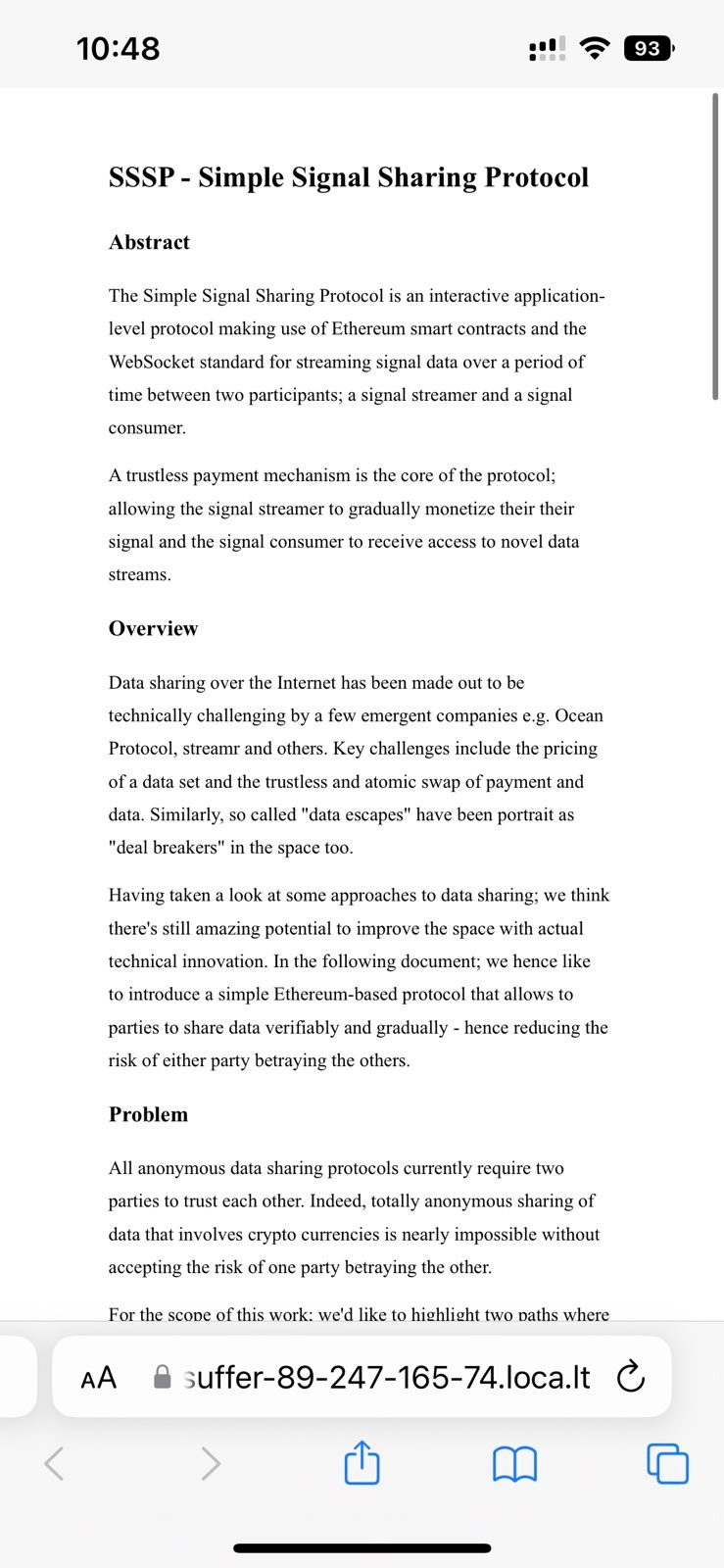
I sadly have to disagree that this looks good on all devices. The text on my iPhone is too small.

signal-2022-11-08-104910_002

@TimDaub
Copy link

TimDaub commented Nov 18, 2022

I just re-launched my blog with the tricks from this gist. Thanks for all the tips: https://proofinprogress.com

@heymatthew
Copy link

heymatthew commented Feb 21, 2023

@TimDaub for mobile to scale properly (ala looks tiny on ios), you want to jam this in your <head>

<head>
  <meta name="viewport" content="width=device-width, initial-scale=1.0" />
</head>

@sumon1068
Copy link

@chapmanjacobd
Copy link

I really wonder if more websites would be simple HTML documents if browsers had nicer looking defaults. It's pretty telling to me that I know of ZERO websites which aren't at least as much CSS as actual text content. It must be on purpose :/

Sign up for free to join this conversation on GitHub. Already have an account? Sign in to comment